
This post was inspired by some feedback I got during Kingston University’s Bright Ideas Sprint Weekend and the final competition. When pitching our product to people, some people gave us some interesting and useful feedback, while some persons asked these questions; “after someone buys the book, what’s next?”, “and so what?” These sort of questions, came directly or indirectly in the form of a “hmmm” or “did you think about this or that?’’. I began to wonder if we were creating enough value for our target market.
The team had a good idea of what the expected outcome of the product was, we wanted to be able to connect to our customers emotionally so we could be able to create just the right value for them and ultimately convert them to life-long patrons. This is important for every business as the inability for the target market to connect with any product or service emotionally could mean either zero purchase or a one-time-only purchase. In simple terms, emotional connections translate to profitability for a business. One Harvard Business Review article talks about the importance of businesses approaching emotional connections as a science or a strategy and even went further to state that the first step will be to identify “emotional motivators”.
We were targeting a very specific user segment of over 70 but we also needed to appeal to the target customer who would most likely be a generation apart and what these two groups identify as key values will vary. We came to understand that while the user could see our product as one that they could serve as a “prompter for the recall of happy memories” or a “storage book for memories” or “simply a fun way to pass the time”, the much younger customer could be looking for “ a perfect gift for grandma” or the carehome volunteers could be looking for “ a tool for engaging elderly residents meaningfully”. At the end of the day, we still wanted to be able to solve the issue of loneliness amongst the elderly populace.
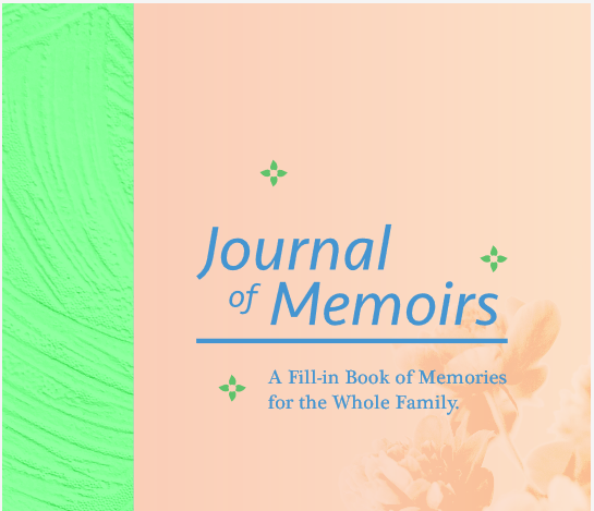
We started by looking at colours because we wanted to be able to evoke the right emotional response to our product from a visual point of view. We found out from some desktop research that the colour orange was identified with “good value” or according to another research “cheap”. Therefore, we included it in the pages of our journal but not on the front or back covers to prevent the cheap look but still communicate good value. We found further research that validated the first finding that blue was the most acceptable colour, and so that was used for the title on our cover page, as well as the alternating page inside the actual journal itself. The process of colour selection was a draining and painstaking one for the team because we wanted the product to be able to stand out, appeal to all genders and while making sure the line between a family oriented activity book and a child’s activity book was not crossed.


For more on creating emotional connections, look out for my next post.
Leave a Reply